Dead Mouse Adventures
⭐ WHY IT MATTERS ⭐
Dead Mouse Adventures stands out by fully embracing a zombie cartoon parody identity rather than relying on traditional horror themes. The combination of the mischievous Dead Mouse character, monochrome haunted-town visuals, and colorful carnival style features creates a memorable and distinctive personality that feels unique to GameArt.
🎨 ART
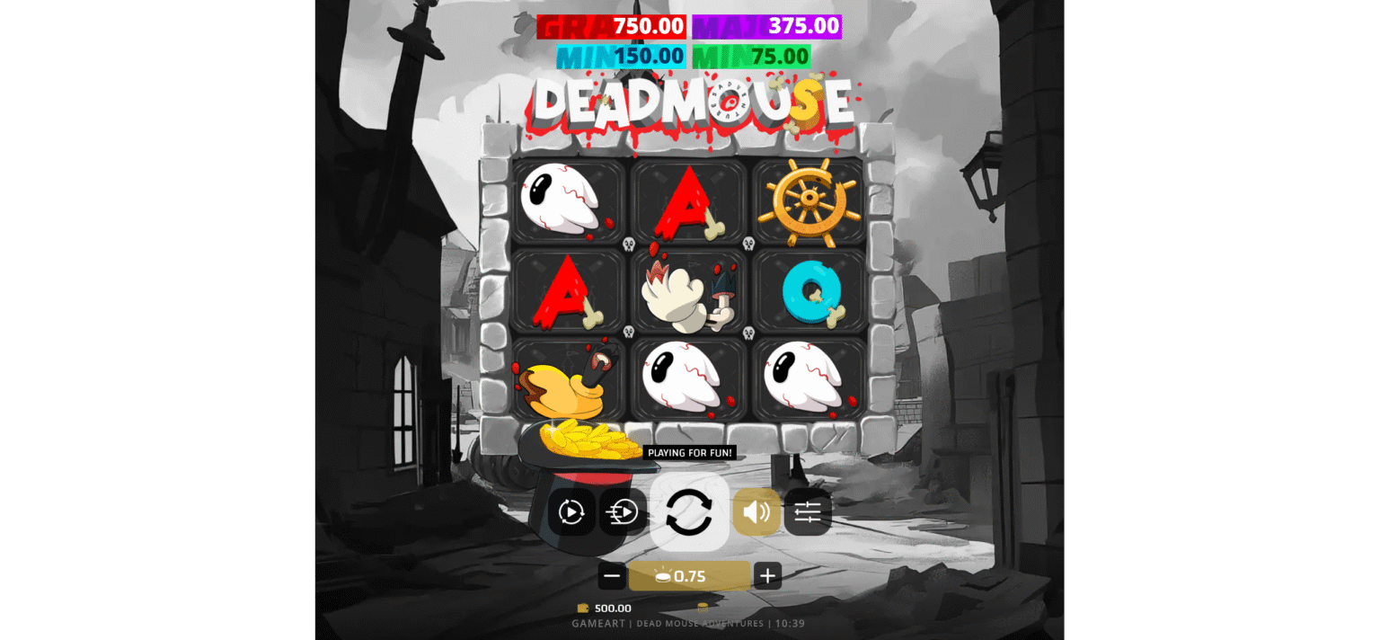
The most striking artistic choice in Dead Mouse Adventures is the contrast between its monochromatic world and its vibrant gameplay elements. The environment is rendered almost entirely in grayscale, featuring deserted streets, crooked buildings, and an atmosphere reminiscent of a haunted town inspired by early era cartoon animation. This black and white presentation instantly establishes the game’s identity as a vintage style parody.
Set against this drab backdrop, the reels pop with vivid colors like toxic green, bright cyan, deep purple, and blood red. This contrast naturally draws the player’s focus to the gameplay while reinforcing the game’s playful tone. The visual distinction between the background and the symbols is highly effective, offering excellent clarity without compromising the atmosphere.
.The title logo itself perfectly encapsulates the game’s identity. Dripping blood effects, exposed bones, and a distressed cartoon style immediately establish the concept of an undead parody. Rather than aiming for realistic horror, the artwork embraces exaggerated cartoon logic and Halloween style humor.
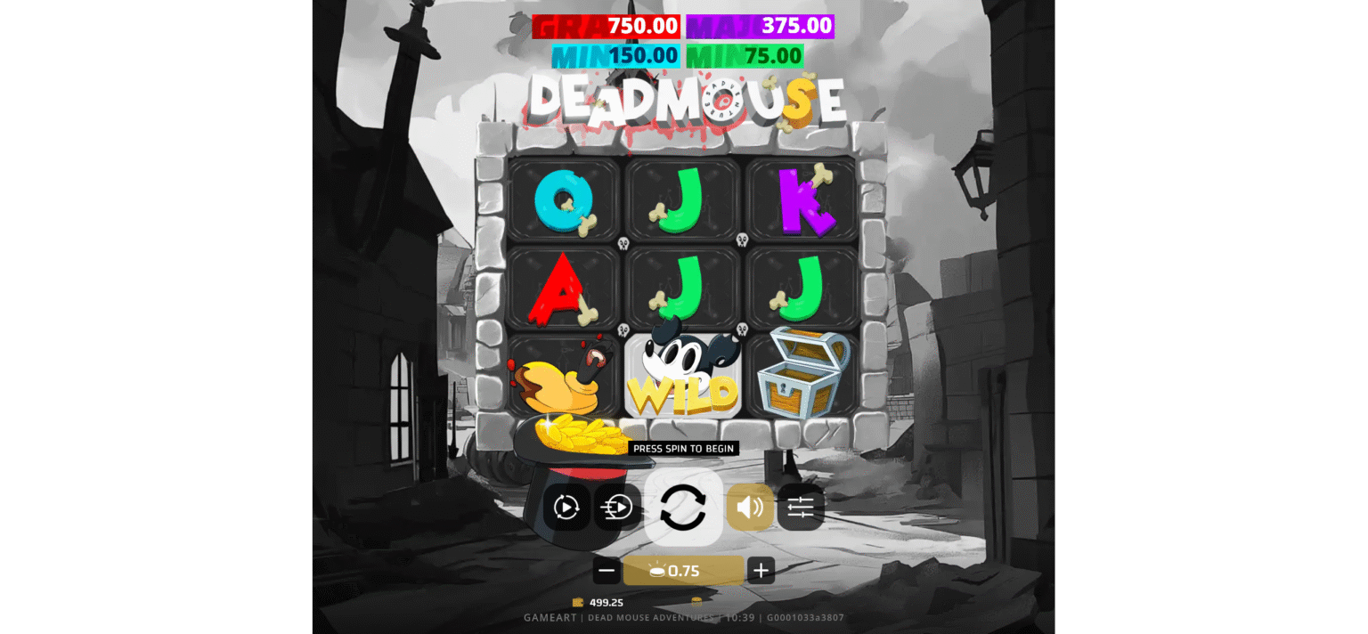
The ‘Dead Mouse Wild’ symbol is undoubtedly the game’s visual centerpiece. The character features large eyes, rounded cartoonish shapes, exposed skull elements, and an intentionally mischievous expression. Notably, the design avoids being truly terrifying.
The symbol set maintains strong thematic consistency throughout the game. Premium symbols, Wilds, bonus icons, ship wheels, and distinctive Venetian style jackpot masks all contribute to the game’s dark carnival identity.
Even the low value card symbols are thematically integrated. The A, K, Q, and J symbols feature irregular shapes, decorative bone like elements, and a cartoon inspired style, helping them blend seamlessly into the game’s visual language.
The grayscale city background deserves special mention. Instead of feeling oppressive, it evokes the atmosphere of a forgotten carnival town or an abandoned animated universe. With its colorful and playful visuals, the mood never quite escalates to genuine horror.
The overall experience is best described as “horror entertainment,” where visual appeal and spooky humor blend seamlessly.
🎞 ANIMATION
In Dead Mouse Adventures, the animation is driven primarily by feature progression, sticky symbols, and sudden bursts of activity. The compact 3×3 layout works surprisingly well, allowing key events to unfold sequentially and creating an immediate visual impact without overwhelming the player.
The most dynamic animation system appears during the bonus game. Triggered by special symbols, this feature introduces sticky symbols that remain on the board as collected values accumulate. This creates a strong sense of progression, as players can visually track the growth of the bonus rather than relying on hidden counters.
As more symbols stick and values rise, the excitement builds naturally through the visible evolution of the board.
The “Special 1 Rush” feature delivers some of the game’s most thrilling animated moments. Bonus symbols can suddenly flood the reels, transforming standard gameplay into high energy sequences filled with unexpected possibilities.
The Venetian style jackpot masks are particularly striking in their presentation. Instead of using standard jackpot icons, the game introduces dramatic carnival masks. While reinforcing the overall theme, they also lend a distinct visual identity to the jackpot moments.
The stacking of symbols one after another is the greatest strength of this animation framework. Players can clearly witness the progression in real time, fostering a stronger emotional connection to the bonus feature than typical, less visible progression systems do.
Rather than relying on lengthy cinematic sequences, the game builds excitement through escalating chaos, continuous feature progression, and surprise activations. Each feature contributes to the sensation that the player’s cartoon nightmare is becoming increasingly unpredictable.
🔊 SOUND
The audio direction naturally complements the game’s “dark cartoon carnival” identity. Rather than embracing realistic horror, the soundscape is perfectly suited for playful, Halloween style entertainment.
The ideal audio language for this world features distorted carnival instrumentation, exaggerated cartoon sound effects, mischievous musical cues, and dynamic audio intensity tied to game features. These elements reinforce the game’s parody driven tone while maintaining thematic consistency with the visuals.
A more serious horror soundtrack would likely clash with the artwork; the game’s visual personality demands something playful, whimsical, and slightly chaotic.
The sound design is highly effective in supporting bonus progression, sticky symbol accumulation, and jackpot activations. Every successful collection event benefits from responsive audio feedback that reinforces the sense of progression and the anticipation of rewards.
The carnival setting also creates opportunities for quirky musical motifs and exaggerated feature sounds that further strengthen the game’s identity. It helps transform ordinary gameplay events into memorable moments while preserving the game’s humorous nature.
Instead of fear or suspense, the emotional experience here centers on curiosity, surprise, amusement, and delightful unpredictability.
The audio framework works best when viewed as an extension of the game’s whimsical, cartoonish world. By complementing the progression of features and the carnival inspired atmosphere, the sound design helps unify the game’s visual and mechanical identity.
Its role is not to frighten the player, but to further reinforce the quirky, humorous world created by the game’s art.